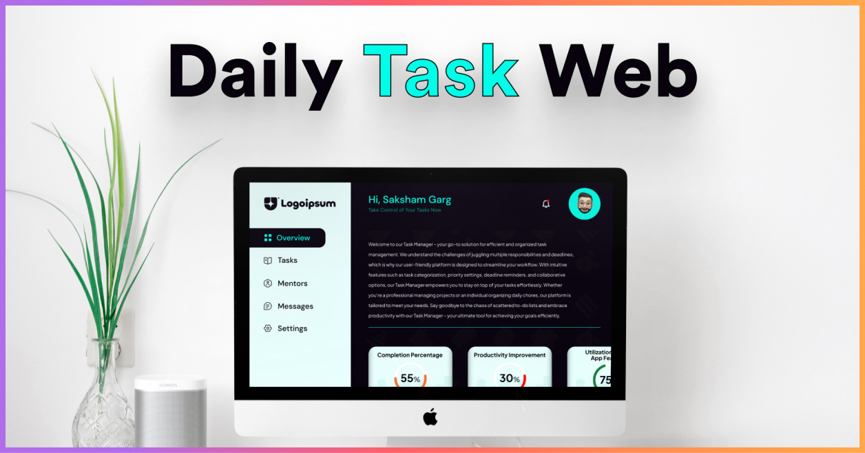
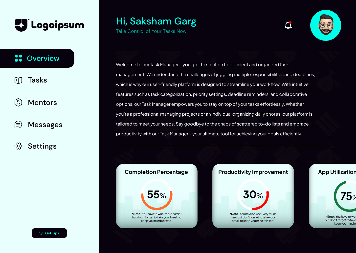
My task manager Web portal design encapsulates a perfect blend of user-centricity and streamlined productivity. The design is deeply rooted in an intuitive interface that not only simplifies the user journey but also creates a visually pleasing and engaging user experience. With purposeful animations that engage without overwhelming, the design successfully guides users through their tasks, making it an interactive and enjoyable process. A well-thought-out information hierarchy ensures effortless navigation, presenting task-related details in a clear, concise, and structured format, thereby eliminating potential confusion. One of the standout aspects of the portal is the integrated performance index, a powerful tool that empowers users to track their productivity levels and make necessary adjustments to enhance their efficiency. The design is further enhanced by a simplified task management process, which simplifies user interaction, thereby reducing cognitive load and enhancing overall user satisfaction.
Intuitive Interface: I have designed an interface that prioritizes user needs, employing a user-centered design approach. This involved careful placement of elements, clear labeling, and logical flow, ensuring users can navigate the portal effortlessly and find what they need without confusion.
Animations for Engagement: I have strategically implemented animations to enhance user engagement without distracting from the primary tasks. Animations were used purposefully to guide users' attention, provide feedback on interactions, and create a more enjoyable user experience.
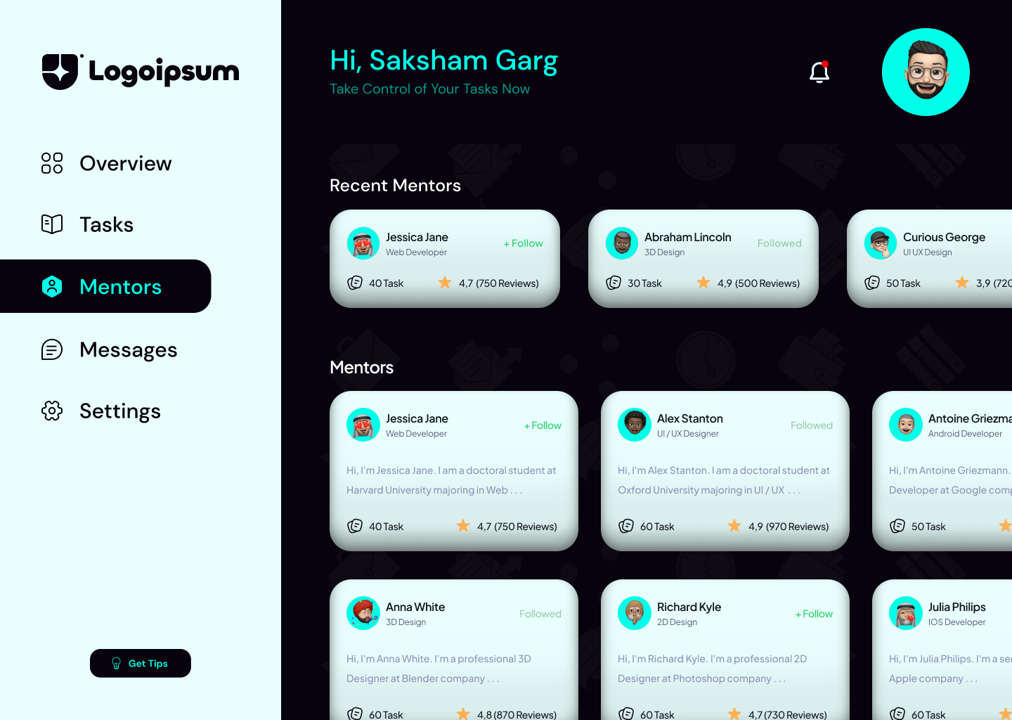
Clear Information Hierarchy: I have established a logical information hierarchy by organizing content in a visually intuitive manner. This hierarchy aids users in quickly understanding the most critical information, ensuring that task-related details are presented in a structured and easily digestible format.
Performance Index Integration: I have introduced a performance index that quantifies and visualizes users' productivity. This index offers insights into task completion rates, time management, and overall productivity, allowing users to track their progress and make informed decisions for improvement.
Simplified Task Management: I have streamlined the process of managing tasks by designing an interface that simplifies adding, editing, and organizing tasks across different categories (personal, professional, health, and family). This simplicity reduces cognitive load and enhances efficiency.
Animated Split Screens: The use of animated split screens can provide a dynamic user experience, allowing for simultaneous interaction with multiple tasks or different aspects of the application.
Color Combination: A strategic color combination can enhance the visual appeal and usability of the app, with contrasting colors for important elements and softer tones for general interfaces.
User-Friendly Design: Ensuring the design is user-friendly is crucial. This includes easy-to-understand instructions, intuitive navigation, and a clutter-free layout.
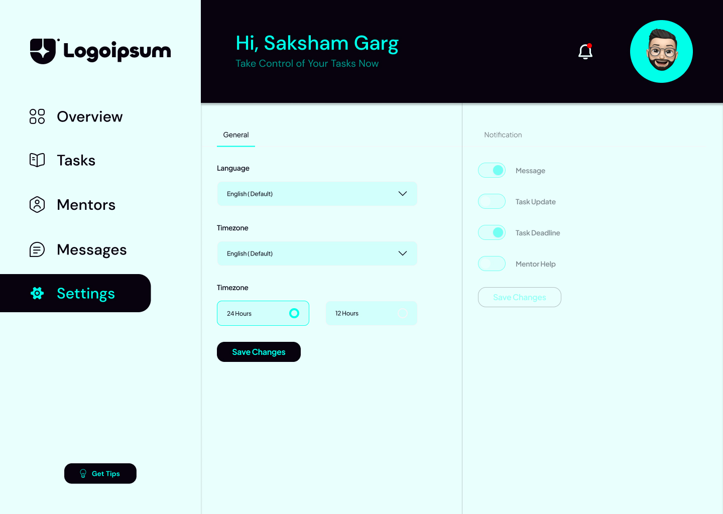
Customization Options: Providing customization options, such as theme changes or adjustable settings, can enhance user satisfaction as it allows users to personalize their experience.
Interactive Elements: Incorporating interactive elements can make the task management process more engaging. This can include functionality for tasks, interactive charts for productivity tracking, etc.
